Case study · ShopSM · 2021–2022
One app for a department store and a supermarket.
Two shops, one app, and a cart that knows which is which.
- 2
- Storefronts
- 2
- Brand generations
- App + web
- Surfaces
SM Store and SM Markets, in one app.
Designed under the old branding, then carried into the new.
One design language across both.
The situation
ShopSM is the e-commerce arm of SM Retail, the Philippines’ largest retailer. Two very different businesses sat behind one app. SM Store, the department store: fashion, shoes, home, brands. SM Markets, the supermarket: fresh produce, pantry, weekly baskets. Different products, different delivery logic, different reasons to open the app at all.
The design function was small. The seat: UX leadership across app and web, setting direction, and growing a junior designer along the way.
The work
Research. Research set the direction for app and web. From there, feature and process flows were shaped with the project manager and the IT head, so what got designed was also what could get built.
The design. The core problem was navigation before it was visual. A few decisions carried most of the weight:
- A store switcher at the top of every screen. SM Store or SM Markets, one tap, and categories, deals and search follow.
- Location first for groceries. SM Markets starts from a delivery address and a nearby branch, with delivery or pick-up chosen at the cart.
- Separate carts per store. Clearly labelled, so a pair of shoes and a week of groceries never collide at checkout.
- No account wall. Guest checkout and social sign-in on the welcome screen, so browsing never waits on a form.
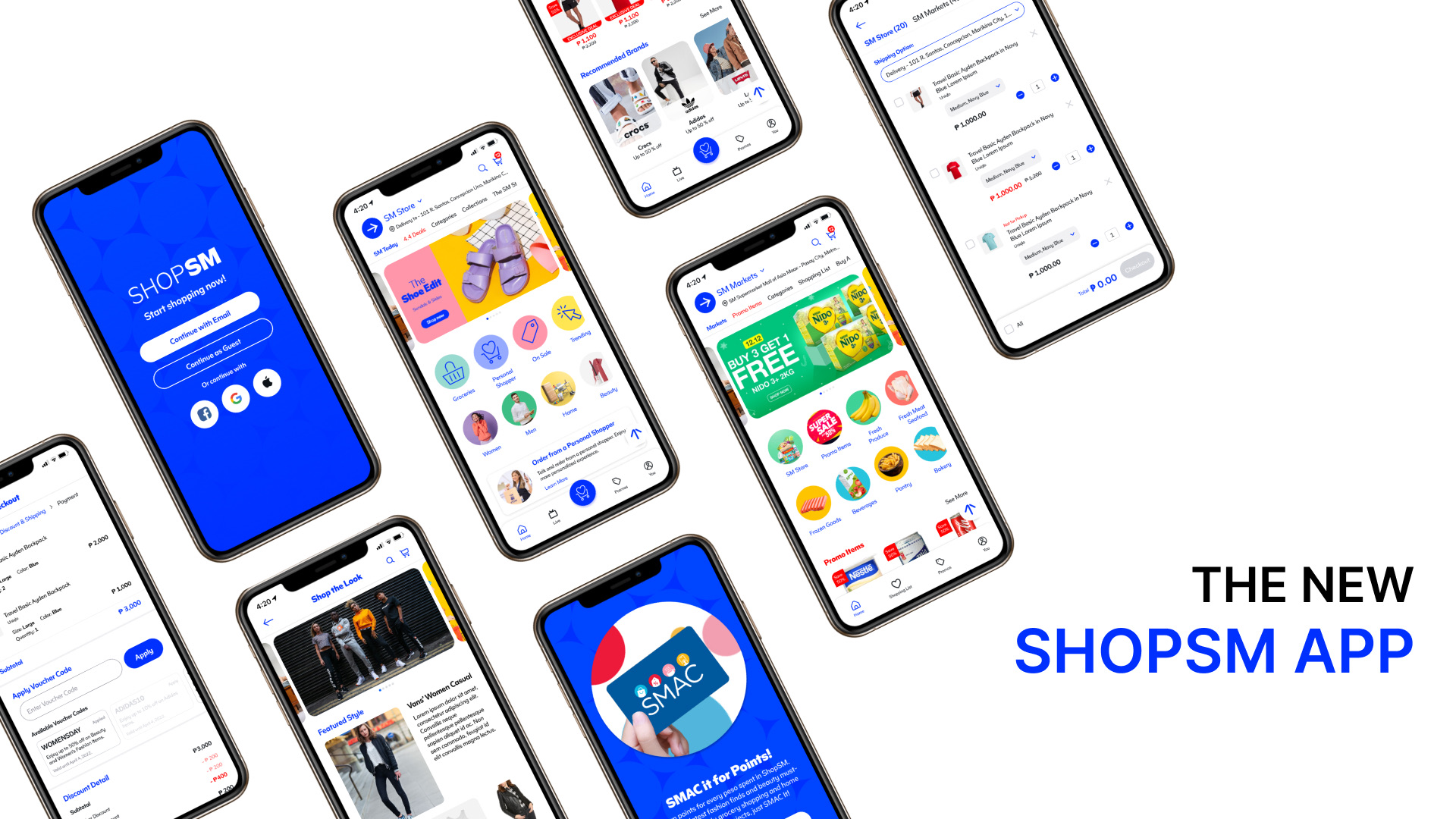
- Loyalty in the flow. SMAC points surfaced in the app instead of living on a separate card.
- Retail moments. Deals, featured brands, Shop the Look, a personal shopper, vouchers at checkout. Plus the unglamorous states, like a clear offline screen with a retry.
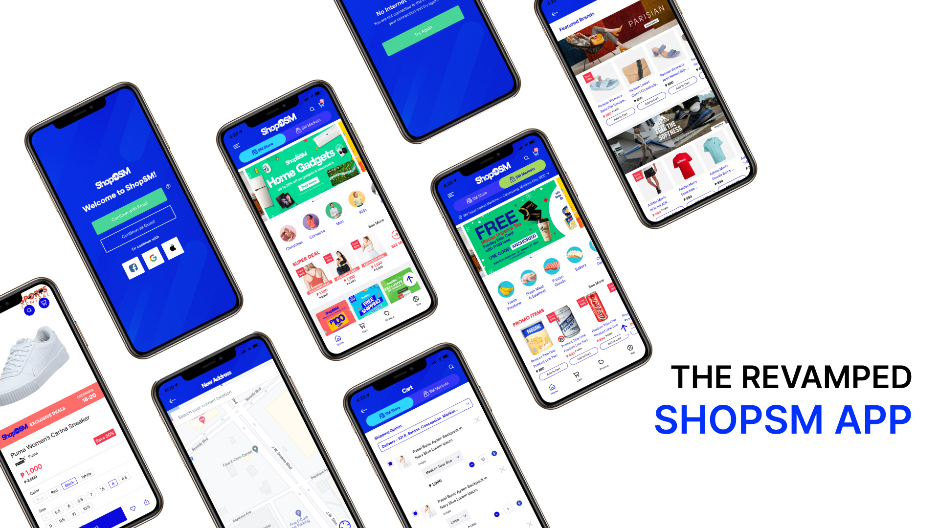
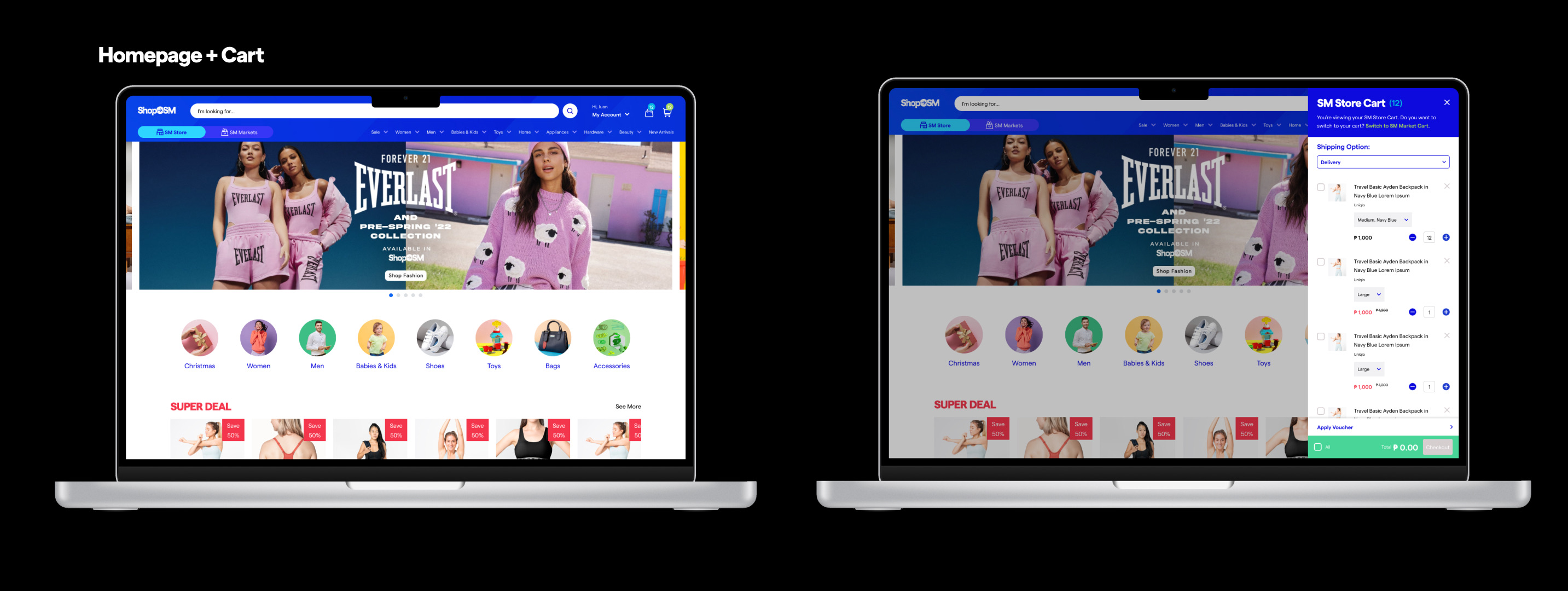
The rebrand. Then ShopSM moved to a new brand. The structure held: store switcher, split carts, loyalty, the same flows, redrawn in the new visual language.
Who did what
Design direction and UX across app and web came from this seat. A junior designer grew into the work alongside, with mentoring and real ownership. Product and IT shaped the feature and process flows together with design. Marketing set release timing and campaigns, and features were designed to land with them. Engineering built it.
A pair of shoes and a week of groceries should never meet at checkout.
What it taught
Two shops in one app is an information architecture problem first. Get the switcher, the carts and the location logic right, and the visual layer can change underneath without breaking anything, which is exactly what the rebrand tested.
It was also the first time running the design practice, not just the designs: crit, reviews, weekly syncs, design in the planning conversation instead of after it. Those habits travelled.
Two shops, one app, one cart that knows the difference.