Case study · TayoCash · 2020–2021
A digital wallet, front to back office.
A wallet is three products: the app, the site, and the back office nobody sees.
- 3
- Surfaces
- 3
- Verification tiers
- 18
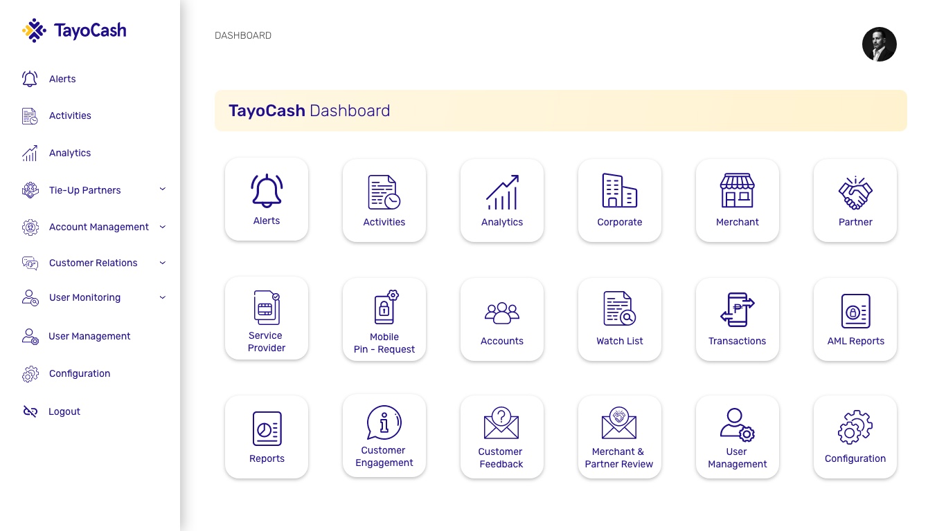
- Back-office modules
App, website and back office.
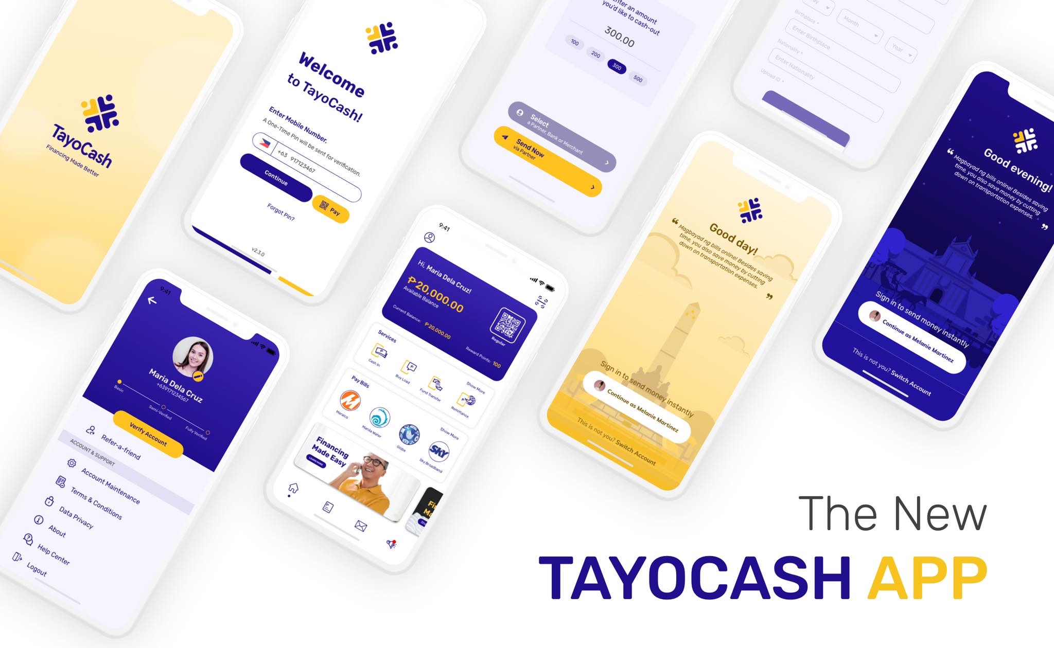
Basic, semi-verified, fully verified, shown on the profile.
From transactions to AML reports and watch lists.
The situation
TayoCash is a digital wallet for the Philippines. Send money, pay bills, buy load, cash in and cash out through partner banks and merchants.
A wallet is also a regulated product. Every account needs verifying, every transaction needs watching, and the business needs its own tools to do both. The seat: senior IC across the whole product, website and app end to end.
The work
Foundations. Before screens, structure: user journeys, flows and sitemaps for the wallet, and process flows for the business operations behind it. Most of what follows sits on that map.
The app. The decisions that mattered most were about trust and speed:
- Sign in with a phone number. A mobile number and a one-time PIN, nothing else to remember.
- Coming back is one tap. Returning users are greeted by name and time of day, with their account ready to continue, and a “not you?” switch for shared phones.
- Home is a balance and a list of verbs. Balance and QR up top, then cash in, buy load, fund transfer, remittance, and the most common billers.
- Verification as progress, not a wall. The profile shows where an account sits, from basic to fully verified, with Verify account as the one clear next step.
- Cash-out without typing. Preset amounts and a partner or merchant picker.
- Help that knows the topics. An in-app chat that starts from the questions people actually ask: getting started, membership, verification.
The back office. The part customers never see, and the part the business ran on. One dashboard for the operations, compliance and support teams: alerts, activity, analytics, corporate, merchant and partner accounts, transactions, AML reports, a watch list, mobile PIN requests, customer feedback, and the configuration behind it all. Eighteen modules in all.
The website and the brand. The website, the splash and loading animations, and the instructional videos for new feature rollouts. Brand and marketing design too, whenever the work needed it.
Who did what
Design across the app, the website and the back office came from this seat, as a senior IC. Product and engineering built it. Marketing shaped how new features reached people, and design work followed the launches.
The screens nobody sees decide whether the ones they do can work.
What it taught
Back office is product too. A verification flow in the app is only as good as the review queue behind it, and an AML report nobody can read is a risk, not a feature. Designing both sides at once made that obvious early.
It is also where the systems instinct first showed up. Journeys and sitemaps before screens, operations before polish. That order stuck.
The screens nobody sees decide whether the ones they do can work.